Kider’s new image is linked to the company’s own evolution, marking a clear commitment to technological integration and alignment with the current times.
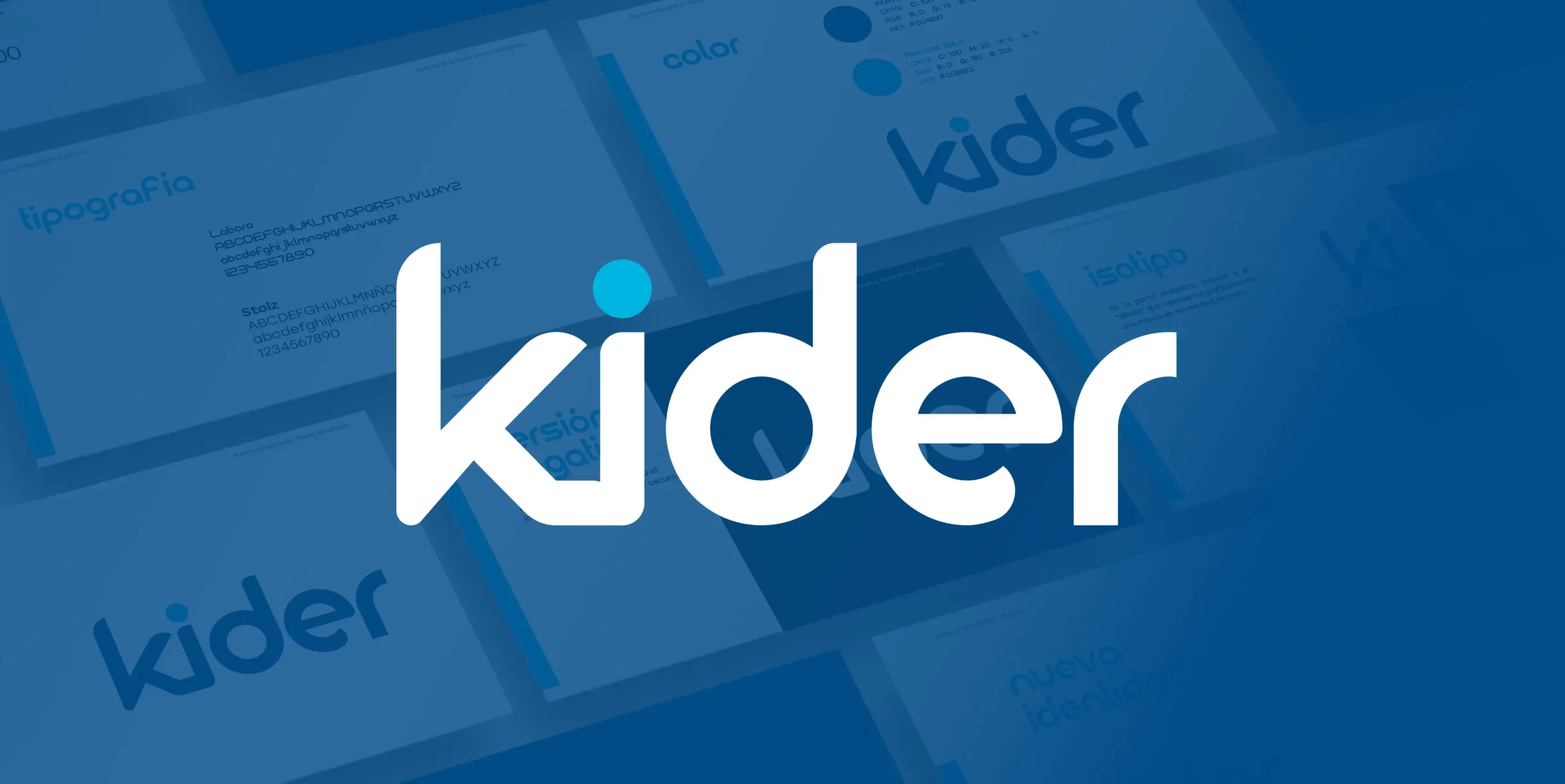
This new logo simplifies the name from Kider Store Solutions to Kider, since the brand itself is already established and known by itself thanks to its leadership in the sector. In addition, it keeps the main colors and includes several references that make it a meaningful logo.
The union of the ‘k’ and the ‘i’ reflects the pieces fitting together perfectly. Also noticeable is the dot of the ‘i’, which sports another shade of blue and references the dial that previously stood out in Kider Store Solutions as a sign of its overall solution.
These changes are accompanied by a complete update of our website in order to adapt it both to the new brand image and to new market trends.
An improvement has also been made to Kider’ s Linkedin page, where everyone can follow the company’s news to keep up to date with the latest news through the link: https://es.linkedin.com/company/kider-store-solutions.
In addition to this new brand image and an updated website in line with market demands, this new phase will incorporate technology as a key ally of the company.
The goal is to keep improving, keep growing and keep making Kider a benchmark in the sector. From its base to its digital positioning, we hope you like it!